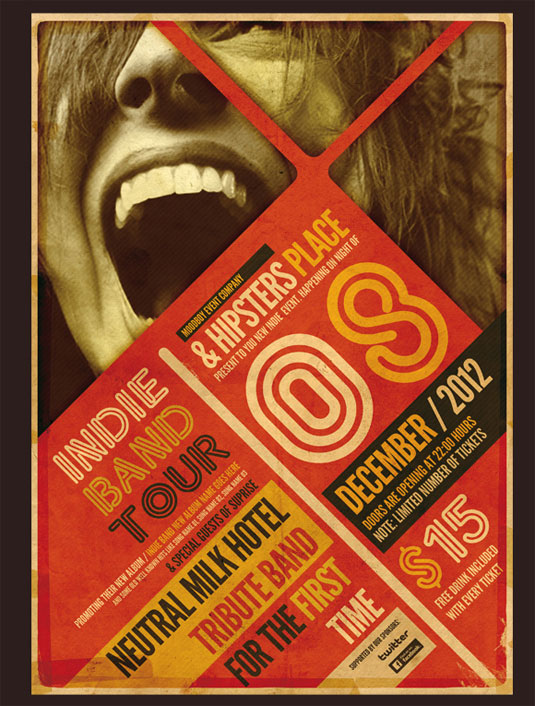
This Design is trying to get you to go to the concert that it is advertising. I see a lot of warm colors like red and orange and yellow and the person in the back round has an orange tint to it. Well, the date for the concert on the poster is December 2012 so it was made in this decade. The font family on this piece is very important, it not only grabs the eye it fits the somewhat abstract theme that is present in the piece. Its easy to read and its bold so it really fits. The tint on the person in the back round is very interesting. It fits the color theory of warm colors and it makes the photo look old and cool. I really like the tint and I don't really think that the photo would look better with any other color as a tint. The piece overall is really cool.
