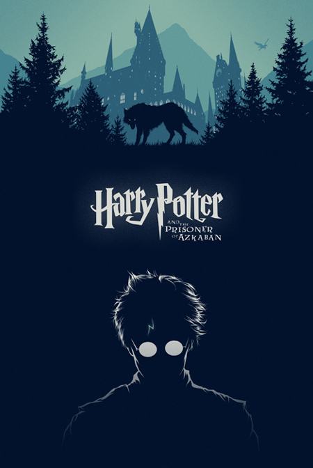
The color theory and I see in this piece is cool and monochromatic with all of the blue but different shades of blue. This design is trying to get you to see the movie and read the books. The font on this piece is sans-serif because all of the lines on each letter are about the same size. What I like about this design is the simplicity of it. The fact they only use one color besides white really makes it cool. The glasses look like they are glowing because of the dark back round and so does the birthmark on his forehead. I also love this design because it goes from dark on the bottom to lighter and lighter at the top.
