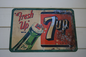
This Design is trying to get you to buy their product "7up". They want you to drink their product. The color theory I am seeing is Complimentary because of the green and red. They are across from each other on the color wheel. I'm going to guess the decade that the sign was made in was the 50's not only because the sign looks beaten up and aged but because the soda is in a bottle and not a can and people drank soda from bottles back then. And I looked at the logo and its kind of just a simple logo not a lot of detail like the one today. The piece has a Balanced composition because of the large logo and the equally large soda bottle, they balance each other. Personally, I think this piece has Asymmetrical balance because there is the large logo on the right and then there is the bottle and the "fresh up" words on the left that balance the whole thing out. The last time I had a "7up" was yesterday. We had some in the fridge because it helps stomach aches. The man who invented "7up" originally named the product with a very long and complicated name but he changed it to the name it has now because it apparently had 7 natural flavors mixed into one soda.
